

Table of Contents
Table of contents
Brand font pairing gets treated as a matter of taste. Mostly it is a matter of contrast, and once you understand that, the guesswork disappears.
The one rule underneath everything
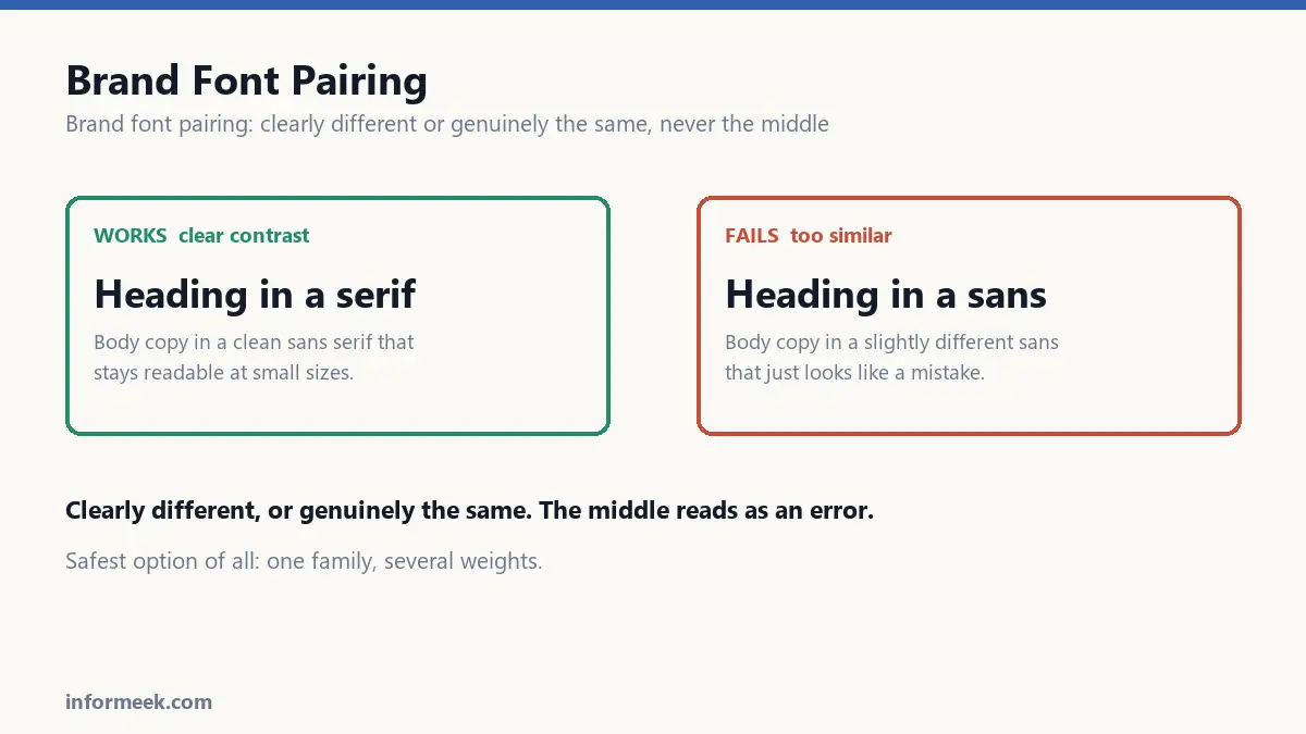
Two typefaces should be clearly different or genuinely the same. What fails is the middle.
Two similar sans-serifs sitting together do not read as a deliberate pairing. They read as a mistake, because the eye notices they differ without understanding why. It looks like someone used the wrong font by accident, which is usually exactly what happened.
So either commit to obvious contrast, or use one family throughout and vary the weight.
Brand font pairing and pairings that reliably work
Serif headings, sans body. The classic. Headings get character and authority; body copy stays clean at small sizes. Hard to get wrong.
Sans headings, serif body. The inverse, and often better for long reading. Serifs are comfortable in extended text and the sans headings feel modern.
One family, many weights. The safest option of all, and underrated. A good family with light through black gives you plenty of hierarchy with guaranteed harmony. If you are unsure, do this.
Display heading, neutral everything else. One characterful face used only for large headings, with something quiet underneath. The display face carries the personality; the workhorse carries the reading.
What to check when comparing two
X-height. The height of a lowercase x relative to the capitals. Two faces with very different x-heights look mismatched even at the same point size, and one will appear larger than the other.
Contrast within the letterform. The difference between thick and thin strokes. A high-contrast elegant serif and a chunky uniform sans fight each other.
Width. A condensed face beside a wide one rarely settles.
Period. Typefaces carry their era. A geometric sans from the 1920s and a humanist face from the 1990s can be made to work, but they are speaking from different decades and you should do it on purpose.
Two is the number
Most brands need two typefaces. Some need one. Almost none need four.
Every additional face is another thing to license, install, load on a website and get consistently right across a team. The cost is real and the benefit shrinks fast.
If you find yourself wanting a third, the honest question is usually whether the hierarchy is unclear rather than whether the fonts are insufficient.
The practical checks people skip
- Read it at body size. A typeface that looks beautiful at 60pt can be unreadable at 10pt. Test at the size you will actually use.
- Check the numbers. Many faces have odd, inconsistent digits. If your brand shows prices or data, look at 0 through 9 before committing.
- Check the languages you need. A face without accented characters, or without the script your market reads, will break the moment you expand.
- Check the licence. A desktop licence does not cover a website, and web use is often priced by monthly page views. This surprises people expensively.
- Check the weights exist. If you need a light and a black, confirm they are real cuts, not something the software fakes by smearing the outline.
The free option, honestly
Open-source typefaces are genuinely good now, and many are used by large brands. They are free for any use, including commercial, and they solve the licensing problem entirely.
The trade-off is ubiquity. The most popular ones are on a very large share of the web, so they will not make you distinctive. That is a real cost if the whole point is standing out.
A reasonable compromise: pay for one characterful face used in headings and the logo, and use a solid free family for body text. You get distinctiveness where it is visible and save money where it is not.
Combinations that reliably work
Rather than naming specific typefaces, which date quickly, here are the structural pairings that hold.
High-contrast serif with a neutral grotesque. The serif carries personality in headings, the sans disappears politely into body copy. The most reliable combination there is.
Geometric sans with a humanist serif. Modern headings, comfortable long-form reading. Good for anything with substantial text.
A single superfamily. Families that ship matched serif and sans versions solve the problem entirely, because the harmony was designed in.
One display face plus one workhorse. The display face appears only at large sizes and only occasionally, which is what keeps it from becoming tiring.
Mistakes worth avoiding
- Two similar sans-serifs. Reads as an accident rather than a decision.
- Using a display face for body copy. Characterful at 48pt, exhausting at 10pt.
- Faking weights. If a family has no bold, software will smear the outline. It looks wrong and prints worse.
- Ignoring the numerals. If you show prices or data, check 0 through 9 before committing.
- Skipping the licence. A desktop licence does not cover a website, and web licences are often billed by page views.
Common questions
How many typefaces should a brand use? Two for most, one for many. Every extra face is another licence, another web font to load, and another thing for a team to get inconsistently wrong.
Are free fonts good enough? Genuinely yes, and several are used by large brands. The trade-off is ubiquity: the most popular ones appear on a very large share of the web, so they will not make you distinctive.
What is a fallback font and do I need one? Yes. Somebody will build a presentation on a machine without your licensed font installed. Nominate the closest widely available substitute in your guidelines so the fallback is chosen rather than random.
Do web fonts slow a site down? They can, noticeably. Load only the weights you actually use, subset to the characters you need, and check that text remains visible while the font loads rather than flashing invisible.
Related reading
Continue with Brand Identity Elements, Brand Guidelines Document, Logo Design Principles. For the underlying standard, see Google Fonts Knowledge.
Join the discussion