

Table of Contents
Table of contents
- It has to survive being small
- Logo design principles and it has to work in one colour
- Gradients are a liability
- Distinctive beats beautiful
- Simple survives
- The hidden meaning trap
- Things people worry about that do not matter
- The checklist before signing off
- Running the six checks
- Mistakes that recur
- Common questions
Most logo advice is about taste. The logo design principles that actually decide whether a mark works are closer to engineering, and they can be checked rather than argued about.
It has to survive being small
A logo is designed on a large screen and used at 16 pixels in a browser tab.
Fine lines close up, small gaps fill in, delicate detail turns to mush. Anything requiring more than a few pixels to read has failed at the size it will most often be seen.
The test: print it at 15mm wide and look at it at arm’s length. Then shrink it to a favicon. If the shape is still identifiable, it holds.
Logo design principles and it has to work in one colour
Convert it to solid black. If it falls apart, the design was relying on colour to separate its parts, and colour is the first thing that goes.
Single colour is not an edge case. It is a stamp, an embroidered shirt, an engraved pen, a fax, a newspaper, a laser-etched box, a watermark. Any of those will happen eventually.
Design the one-colour version first and add colour afterwards. Doing it that way round makes this problem impossible.
Gradients are a liability
A gradient looks good on a screen and causes problems everywhere else.
It cannot be embroidered. It bands when printed on cheap stock. It cannot be engraved, foiled or cut from vinyl. It will not reduce to one colour without redesign.
Use one if you like, but keep a flat version that is genuinely equivalent rather than a diminished afterthought.
Distinctive beats beautiful
A logo’s job is recognition, not decoration. It has to be told apart from your competitors at a glance, by someone not paying attention.
This is why the swoosh, the abstract arc and the geometric hexagon are weak choices. They are perfectly attractive and completely interchangeable. Put ten of them together and nobody can attribute any of them.
The check: put your logo on a page beside your ten nearest competitors. If a stranger cannot pick yours out after five seconds of looking, it is not distinctive enough, however well drawn it is.
Simple survives
The logos that last are the ones you could describe over the phone. A shell. An apple with a bite. Four rings.
That is not a style preference; it is about memory. People do not remember images accurately, they remember a simplified impression. A logo already close to that impression is remembered correctly. A detailed one is remembered as a vague blob.
The practical version: can someone who has seen it twice draw it roughly from memory? If not, it is too complicated.
The hidden meaning trap
Designers love a clever negative-space detail, and clients love being told about it.
Worth being honest: almost nobody notices these, and a logo that needs explaining to be appreciated is not doing its job in the two seconds it actually gets.
Cleverness is a bonus on top of a shape that already works, never a substitute for one.
Things people worry about that do not matter
- Whether it explains what you do. Most famous logos do not. The apple does not sell fruit.
- Whether everyone likes it. Design by consensus produces the least objectionable option, which is rarely the most memorable one.
- Whether it feels timeless immediately. Timelessness is what we call things that were used consistently for long enough.
The checklist before signing off
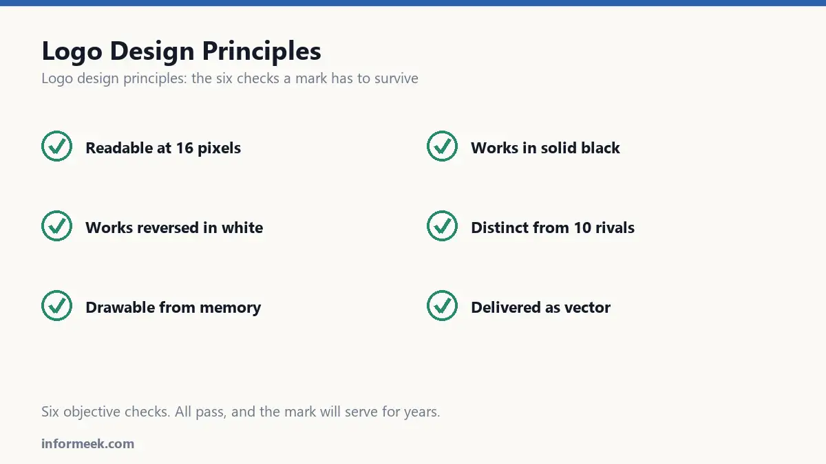
- Readable at 16 pixels.
- Works in solid black.
- Works reversed in white on dark.
- Distinguishable from ten competitors at a glance.
- Drawable from memory after two viewings.
- Delivered as vector, with a flat single-colour variant.
Six checks, all objective. A logo passing all six will serve you for years, whether or not the first meeting was enthusiastic about it.
Running the six checks
These take about ten minutes and settle most arguments, because they replace opinion with observation.
Print it at 15mm wide. Not on screen. On paper, held at arm’s length. Detail that vanishes here vanishes on a pen, a badge and a favicon.
Convert it to solid black. If it collapses, the design was using colour to separate its parts, and colour is the first thing to go.
Reverse it to white on a dark ground. Thin shapes often close up or disappear entirely when reversed.
Place it among ten competitors. Ask someone unfamiliar to point at yours after five seconds.
Ask someone to draw it from memory after seeing it twice. If they cannot, it is too complicated to be remembered accurately.
Confirm it exists as vector with a flat single-colour variant that is genuinely equivalent rather than a diminished afterthought.
Mistakes that recur
- Designing for the pitch rather than for use. A mark that looks magnificent at full screen and fails at 16 pixels has been optimised for the wrong moment.
- Relying on a gradient. It cannot be embroidered, engraved, foiled or cut from vinyl.
- Choosing an interchangeable abstract shape. Perfectly attractive and completely unattributable.
- Designing by committee. Consensus produces the least objectionable option, rarely the most memorable.
- Expecting instant timelessness. Timeless is what we call marks that were used consistently for long enough.
Common questions
Should a logo explain what we do? Most famous ones do not. Recognition matters more than description, and a mark that tries to depict a whole business usually becomes cluttered.
Wordmark or symbol? A wordmark teaches your name, which is valuable when nobody knows it yet. A symbol only works once people already associate it with you, which takes years and consistent use.
Is hidden meaning worth pursuing? As a bonus on a shape that already works, yes. As a substitute for one, no. Almost nobody notices, and a logo needing explanation is not doing its job in the two seconds it gets.
How do I know when it is finished? When it passes all six checks and you have stopped changing it for reasons you cannot articulate. Endless refinement past that point is usually discomfort with commitment.
Related reading
Continue with Brand Identity Elements, Logo File Formats, Brand Guidelines Document. For the underlying standard, see the WCAG contrast requirements.

Join the discussion