

Table of Contents
Table of contents
A luxury color palette is not a list of shades you copy from someone else. It follows a small set of rules, and once you can see the rules you can build one for any brand.
Restraint is the whole thing
Look at expensive brands and count the colours. It is usually two. Sometimes three. Almost never more.
Budget brands use many colours because each one is trying to grab attention. Premium brands use few because confidence reads as not needing to shout. That contrast is doing more work than any specific shade.
So the first move in building a luxury palette is subtraction. Whatever you have, remove something.
Luxury color palette and desaturate
Pure, fully saturated colour reads as cheap. Not because bright is bad, but because bright is what discount signage uses, and people have learned the association.
Take any colour and pull the saturation down. A vivid red becomes burgundy. A bright blue becomes navy. A strong green becomes forest. The hue is unchanged; the impression is entirely different.
As a rough working range, keep saturation under about 40% for your main colours. It is a blunt rule and it works.
Never use pure black or pure white
This is the change that does the most for the least effort.
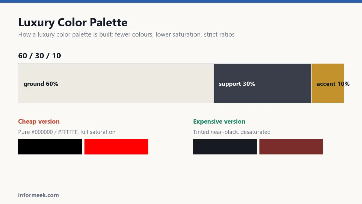
Pure black at #000000 is flat and slightly harsh. Real black objects have a tint. Move to a very dark charcoal with a hint of blue or brown, and it immediately reads more considered.
The same for white. Pure #FFFFFF is clinical. A warm off-white, closer to paper or bone, feels expensive for reasons most people cannot articulate but everyone perceives.
Swap those two values and a palette improves before you have chosen a single accent.
The ratio
A palette is not just which colours, it is how much of each. The usual guide is 60 / 30 / 10.
- 60% a neutral ground. Off-white, warm grey, deep charcoal.
- 30% a secondary that supports without competing.
- 10% the accent. This is the colour people will remember.
Most amateur palettes fail here rather than on colour choice. They use the accent at 40% and it stops being an accent, becoming noise instead.
Restraint in quantity is what makes a small amount of colour feel deliberate.
Space is part of the palette
Empty space is expensive. In print it is paper you paid for and left blank. In retail it is floor space holding fewer products. That is precisely why it signals luxury: it visibly costs something.
A restrained palette with cramped layout does not read as premium. The colours and the spacing have to agree.
Metallics, carefully
Gold and silver are the obvious move and the easiest to get wrong.
On screen, a “gold” is just a yellow-brown gradient and often looks cheap. Real metallic effect comes from a physical finish: foil, metallic ink, an embossed surface that catches light.
If a design depends on gold looking genuinely metallic, it needs to be a print finish, not a colour. And it needs to be a print finish you have budgeted for, because foiling is a separate pass.
Check it survives the real world
Two tests before committing.
Convert it to greyscale. If the colours collapse into the same grey, they have identical lightness and will not separate for anyone with colour blindness, or in a black and white print.
Check the contrast for text. A sophisticated mid-grey on off-white can be genuinely unreadable. Anything carrying body copy needs to pass accessibility contrast, and elegance is not a defence.
Then look at it printed. Deep, desaturated colours are exactly the ones that shift most between screen and ink, and a navy that looked rich on a monitor can arrive nearly black on uncoated stock.
Building one, step by step
Start with the neutral, not the accent. This feels backwards and it is the order that works, because the neutral occupies sixty percent of every surface and sets the temperature of everything else.
Choose a warm off-white or a deep tinted near-black. Test it against a sheet of pure white paper; if it reads as dirty rather than warm, you have gone too far.
Then the secondary, which sits between the neutral and the accent in weight. It is usually a muted version of the same family as the neutral: a warm grey against cream, a slate against charcoal.
The accent comes last and gets the least space. Pick it by asking what the brand would be remembered for, then desaturate it until it stops shouting.
What goes wrong
- Using the accent everywhere. The most common failure. At forty percent it is no longer an accent, and the restraint that signalled quality has gone.
- Choosing colours that print badly. Deep, desaturated shades shift most between screen and ink. Test on the actual stock before committing.
- Ignoring contrast for text. A sophisticated mid-grey on off-white can genuinely fail accessibility, and elegance is not a legal defence.
- Copying a palette wholesale. The palette that works for a jeweller will not work for a clinic, because appropriateness is doing the work rather than the specific values.
- Faking metallics on screen. Gold rendered as a yellow-brown gradient usually reads cheaper than no gold at all.
Common questions
How many colours should a luxury palette have? Two or three, plus a neutral. Beyond that it becomes difficult to keep proportions consistent, and inconsistent proportion is what makes a palette look accidental.
Is black and gold always luxurious? No, and it is close to a cliché now. It reads as luxury shorthand rather than as considered design, which is a different signal. A restrained, unexpected palette does more.
Why do expensive brands use so much white space? Because space is visibly costly. Blank paper is paper you paid for and did not use, and empty floor space is floor space not holding stock. The signal works because the expense is real.
Can a bright colour ever be premium? Yes, when it is used sparingly against restraint. A single vivid accent on an otherwise muted ground reads as confidence. The same colour across every surface reads as a sale.
Related reading
Continue with Brand Identity Elements, Color Psychology in Branding, CMYK vs RGB. For the underlying standard, see the WCAG contrast requirements.



Join the discussion