

Table of Contents
Table of contents
Colour psychology charts are everywhere: blue means trust, red means urgency. Most of what they claim about color psychology in branding is too simple to be useful.
Colour does affect how a brand is read. It just does not work the way those charts claim.
What the research actually supports
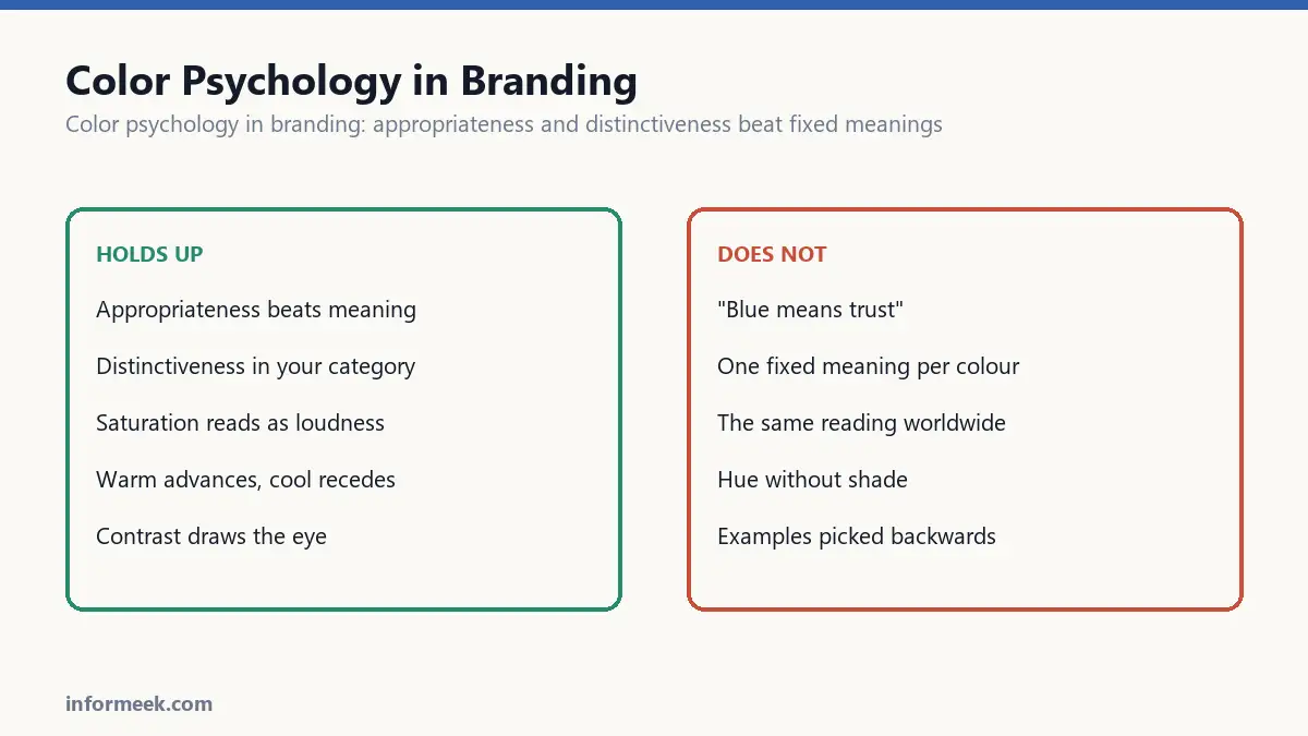
The finding that holds up well is appropriateness. What matters is not whether a colour has a fixed meaning, but whether it fits the thing it is attached to.
Brown is not inherently good or bad. On a chocolate bar it works. On a toothpaste tube it is a disaster. The colour did not change; the fit did.
The second finding that holds is distinctiveness. Colour is one of the strongest recognition cues a brand has, and being different from your category matters more than being “correct”.
Those two ideas, fit and difference, will get you further than any chart.
Color psychology in branding and why the charts are unreliable
Meaning varies by culture. White is a wedding colour in much of the West and a mourning colour in parts of Asia. Red is danger in one place and prosperity in another. Any chart claiming a universal meaning is describing one culture.
Context overrides everything. Red on a warning label and red on a luxury handbag are not doing the same job.
Shade matters more than hue. “Blue means trust” covers navy, sky and electric blue, which have almost nothing in common in feel.
The examples are chosen backwards. Pointing at successful blue brands proves nothing without counting the failed blue ones too.
Look at your category first
This is the most useful hour you can spend, and almost nobody does it.
Put your ten nearest competitors’ logos on one page. You will nearly always find a clear pattern: finance goes blue, organic food goes green, discount retail goes red and yellow.
That pattern is your opportunity. If every competitor is blue, being blue makes you invisible. The category convention exists, and breaking it deliberately is how challenger brands get noticed.
The caveat: conventions sometimes carry real information. Red and white in pharmacy signals medical. Breaking that costs you comprehension, not just familiarity. Know which kind of convention you are breaking.
The things that are genuinely consistent
A few effects are physiological rather than cultural, and they do transfer.
- Warm colours advance, cool colours recede. A red element looks nearer than a blue one at the same distance. Useful for hierarchy.
- Saturation reads as loudness. High saturation feels energetic and cheap; low saturation feels calm and considered. This is consistent across cultures.
- Lightness carries weight. Dark colours feel heavier and more serious. Light ones feel lighter in both senses.
- Contrast draws the eye more reliably than any particular hue.
Those you can build on. “Yellow means optimism” you cannot.
Owning a colour
The strongest colour strategy is consistency over cleverness. A brand that uses one colour relentlessly for years becomes identifiable by it.
This takes time and discipline, and it is undone by every campaign that decides to try something fresh. The colour becomes an asset only through repetition, and repetition is boring to the people inside the company long before it registers with anyone outside it.
That impatience is the main reason most brands never own a colour.
A practical process
- Map the category. Find the convention.
- Decide whether to join it or break it, deliberately, and know what breaking it costs.
- Check appropriateness. Would this colour be strange on this product?
- Check accessibility. Contrast for text is not optional.
- Check it prints. Some screen colours have no ink equivalent.
- Then commit, and keep it long enough to be worth something.
Mapping your category in an hour
This is the most useful exercise available and it needs nothing but a blank page.
Collect the logos of your ten nearest competitors and lay them out together at the same size. Convert the whole page to greyscale as a second pass.
Two things become visible immediately. First, the category convention, which is almost always obvious once the logos sit side by side. Second, which brands separate themselves by lightness rather than hue, since that is what survives greyscale.
Then ask the deciding question: if a customer saw your mark for half a second among these, would they know it was not one of the others?
Where conventions carry real information
Breaking a category convention is usually an opportunity. Sometimes it is a mistake, and the difference matters.
Some colour conventions are decorative habit: banks are blue because banks have always been blue. Breaking that costs nothing but familiarity.
Others carry meaning people rely on. Red and white in a pharmacy context signals medical. Green on a cleaning product signals lower toxicity. Yellow and black together signals hazard almost universally.
Break the first kind freely. Break the second only when you have decided the confusion is worth it.
Common questions
Does colour really affect buying decisions? It affects attention and recognition strongly, and preference far more weakly than the popular claims suggest. Its main job is making you findable and memorable, which is valuable enough without overstating it.
What about colour blindness? Around one in twelve men and one in two hundred women have some form of colour vision deficiency, most commonly difficulty separating red and green. Never let colour be the only thing carrying meaning. Add a label, a shape or a position.
Should colour change for different markets? Rarely worth it. Fragmenting your colour across regions destroys the recognition that makes it valuable. The exception is where a colour carries a genuinely problematic meaning in a major market, which is worth checking before launch rather than after.
How long before a colour becomes ours? Years of consistent use, and it is undone by every campaign that tries something fresh. That impatience is why most brands never own one.
Related reading
Continue with Brand Identity Elements, Luxury Color Palette, Brand Guidelines Document. For the underlying standard, see Nielsen Norman Group on using colour in design.



Join the discussion