

Table of Contents
Table of contents
A business card is the smallest, cheapest thing a brand prints, and the one most likely to arrive wrong. Business card design fails for technical reasons rather than aesthetic ones.
The sizes
There is no single worldwide standard, which surprises people who assume there is.
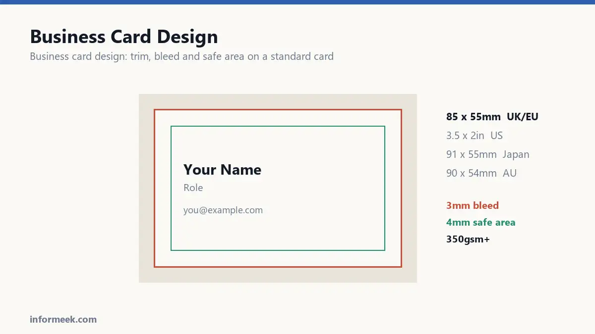
- 85 x 55mm across the UK and much of Europe.
- 3.5 x 2 inches, or 88.9 x 50.8mm, in the US and Canada.
- 91 x 55mm in Japan.
- 90 x 54mm in Australia and much of Asia.
They are close enough to look identical and different enough that a US card will not sit neatly in a European cardholder. For an international audience the European size is the safer default, because it fits most wallets.
Business card design and setting the file up
Build the document at trim size, then add 3mm bleed in the document settings. Do not enlarge the page to include the bleed, which is the most common setup error.
Keep all text at least 4mm inside the trim edge. Cards are cut in thick stacks and the tolerance is worse than on a single sheet, so a name sitting 2mm from the edge will be clipped on some of them.
Work in CMYK from the start, place images at 300 DPI, and outline your fonts before exporting.
The border problem
A thin frame around the edge is the hardest thing there is to print well, and it gets chosen constantly because it looks smart on screen.
Cutting tolerance is around a millimetre. On a 2mm border, drifting one millimetre leaves 1mm on one side and 3mm on the other. It reads as a fault even though the printing was within spec.
Either avoid edge borders, or make them thick enough that a millimetre of drift is invisible.
Stock and finish
Paper weight is measured in gsm. Anything under 300gsm feels flimsy, and people notice instantly even if they cannot name why. 350 to 400gsm is the usual choice for a card that feels substantial.
Matte is understated and can be written on. Gloss makes colour vivid and shows fingerprints. Soft touch laminate feels expensive and costs accordingly. Uncoated absorbs ink, so colours arrive noticeably duller and darker than the proof suggested.
That last point catches people out. A rich navy chosen on screen can arrive nearly black on uncoated stock. If you want uncoated, ask for a sample on that exact paper first.
What goes on it
Less than you think. A card is not a brochure, and overfilling it is the most common design mistake.
Name, role, one phone number, one email, one web address. A street address only if people actually visit. Every extra line forces the others smaller.
Keep type at 8pt or above. 6pt looks elegant in the file and is genuinely hard to read for anyone over forty, which is a large share of the people you will hand it to.
Use the back
Printing both sides costs very little extra. Leaving the back blank wastes the most useful surface you have.
A QR code works well there, provided it is at least 2cm across, keeps its white margin, and is printed matte rather than gloss so it does not reflect straight into the camera.
Test the printed card with a phone before ordering the full run. A code that scans happily on screen may not scan on paper.
Order a sample first
Most printers will produce a small proof run for a fraction of the full cost. It is the only way to know how the colour, the weight and the finish actually feel in the hand.
Considerably cheaper than discovering the problem across a thousand cards.
A complete specification
Everything needed to brief a printer, in one place.
Document at trim size, commonly 85 x 55mm. Bleed 3mm on all four sides, set in the document rather than by enlarging the page. Safe area 4mm inside the trim, with all text inside it. Colour mode CMYK. Placed images at 300 DPI. Fonts outlined before export. Exported as PDF with bleed included.
Paper at 350gsm or above. Finish chosen deliberately, remembering that uncoated stock absorbs ink and prints noticeably duller than the proof suggested.
Mistakes that ruin a run
- A thin border around the edge. Cutting tolerance is about a millimetre, which on a 2mm border is visibly uneven.
- Text at 6pt. Elegant in the file, genuinely hard to read for a large share of the people you hand it to.
- Cramming in every contact method. Each extra line forces the others smaller.
- Choosing uncoated without a sample. A rich navy can arrive nearly black.
- A gloss-laminated QR code. It reflects overhead light straight into the camera.
Common questions
Which size should I use for international contacts? The European 85 x 55mm is the safer default, because it fits most wallets and cardholders worldwide. A US card is slightly wider and does not always sit neatly.
Is a QR code worth including? On the back, yes. Make it at least 2cm across, keep its white margin intact, print it matte, and test the printed card with a phone before ordering the full run.
What paper weight feels professional? 350 to 400gsm. Below 300gsm people register flimsiness immediately, even if they could not name the weight.
Should both sides be printed? Almost always. The cost difference is small and a blank back wastes the most useful surface you have.
Related reading
Continue with Brand Identity Elements, Bleed and Trim, Print Resolution. For the underlying standard, see ISO 216, the international paper size standard.
Join the discussion