

Table of Contents
Table of contents
An icon set fails in a recognisable way: each icon looks fine alone, and together they look unrelated. Good icon design is about constraints agreed before anyone starts drawing.
Start with the grid
Every icon should be drawn inside the same square, with the same padding. 24 x 24 with 2 units of padding is a common choice; the exact numbers matter less than using them consistently.
The padding is what stops icons touching their neighbours and lets them sit on a line of text without crowding it.
Draw everything on whole units where possible. Half-unit positions produce blurry edges when rendered small, because the shape no longer aligns to the pixel grid.
Icon design and optical size beats mathematical size
This is the rule that separates a good set from a mechanical one, and it feels wrong until you see it.
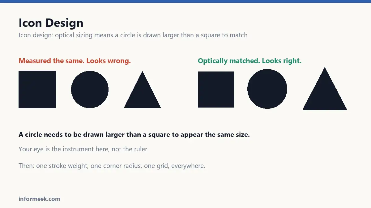
A circle and a square of identical measured height do not look the same size. The circle looks smaller, because less of its area sits near the edges of the bounding box.
So circles are drawn slightly larger than squares, and triangles larger still, until they appear to match. Your eye is the instrument here, not the ruler. Every well-made icon set does this.
One stroke weight, everywhere
Pick a line weight and never vary it. Two icons in a set with different stroke weights is the single most obvious inconsistency, and the eye catches it immediately even when the viewer cannot say why.
The trap: scaling an icon changes its stroke weight. An icon drawn at 24px and used at 48px now has double-thickness lines compared to the rest of the set.
Either draw a separate version for each size, or use software that keeps stroke width fixed while scaling. Do not simply enlarge and hope.
Decide the details once
- Corner radius. Sharp, slightly rounded, or fully rounded. Pick one number and apply it everywhere.
- Line ends. Flat or rounded caps. Mixing them looks accidental.
- Filled or outlined. Choose one as the default. Many sets use outline normally and filled for the active state, which is a system rather than an inconsistency.
- Angles. Restrict diagonals to 45 degrees where you can. Arbitrary angles make a set feel unsettled.
- Perspective. Flat and front-on, or consistently angled. Never a mix.
Recognisable beats accurate
An icon is read in a fraction of a second at a small size. Detail that makes it more realistic usually makes it less legible.
The floppy disk still means save, decades after anyone used one, because the shape is unmistakable. That is what an icon is for: not depicting the thing, but being instantly distinguishable from the icons beside it.
Use established conventions rather than inventing your own. A magnifier means search. Three lines mean menu. Being clever here costs comprehension and buys nothing.
Test the set together
Icons are never seen alone, so never review them alone.
Lay the whole set on one page at final size. Inconsistencies that were invisible on the artboard become obvious: one icon heavier, one sitting slightly high, one with a different corner treatment.
Then squint at it, or blur it. Any icon that becomes indistinguishable from its neighbour needs redrawing, because that is what a hurried user sees.
Export properly
Export as SVG for anything on screen, so the icon stays sharp at any size and can be recoloured with CSS.
Remove the fill colour from the exported file where you want it inherited, so one icon serves light and dark backgrounds instead of needing two versions.
And give every icon a meaningful name in a consistent scheme. A folder of icon1.svg through icon40.svg is a set nobody will use correctly.
Setting up the grid
Icon design advice tends to be abstract, so here is a concrete starting point.
Work on a 24 x 24 square with 2 units of padding, giving a 20 x 20 live area. Use a 2 unit stroke weight. Round corners at 2 units, or keep them sharp, but pick one.
Draw on whole units wherever possible. Half-unit positions produce soft edges when the icon is rendered small, because the shape no longer lines up with the pixel grid.
Then break the grid deliberately for optical correction. A circle drawn to exactly 20 units looks smaller than a 20 unit square, so it goes to 21 or 22 until it matches by eye.
Mistakes that make a set look wrong
- Scaling an icon to a new size. The stroke weight scales with it, so it no longer matches the set. Draw a version per size, or lock stroke width.
- Mixing filled and outlined without a rule. Fine as a system for active states, wrong as an accident.
- Different corner radii across the set. The eye catches this instantly without being able to name it.
- Arbitrary diagonals. Restricting to 45 degrees makes a set feel settled.
- Reviewing icons individually. They are never seen alone, so never approve them alone.
Common questions
Should I do my own icon design or use a library? Usually a library. A good open one is consistent, extensive and free, and building forty icons well is a serious project. Design your own only when the icons themselves need to be distinctive.
How many icons does a project need? Fewer than expected. Start with the ones you genuinely use and add as needed. Large speculative sets mostly go unused and still have to be maintained.
Do icons need labels? Nearly always, unless the meaning is universally established like a magnifier for search. Icon-only interfaces test badly, because a symbol obvious to its designer is frequently ambiguous to everyone else.
What size should icons be exported at? As SVG, so size stops being a question. Remove the hard-coded fill so the colour can be inherited, and one file then serves light and dark backgrounds.
Related reading
Continue with Brand Identity Elements, Brand Illustration Styles, Vector File Formats. For the underlying standard, see the W3C SVG specification.

Join the discussion