

Table of Contents
Table of contents
People use “brand” and “logo” as if they mean the same thing. They do not. A logo is one of several brand identity elements, and usually not the one doing most of the work.
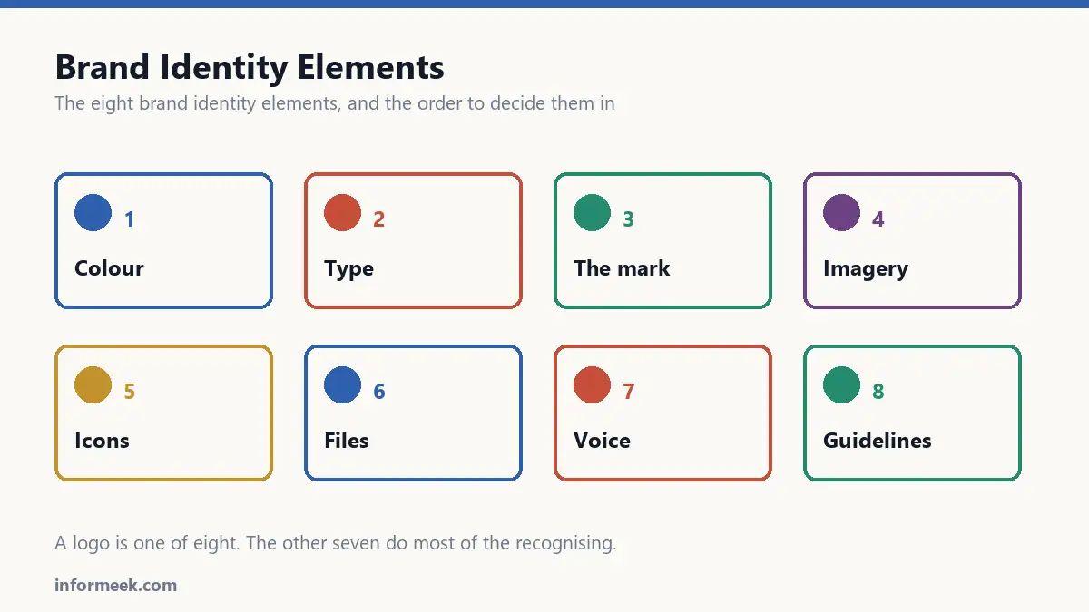
A brand identity is the full set of things that make you recognisable before anyone reads your name. This guide covers each part, and links to a longer explanation of every one.
The test that defines it
Cover the logo. Can someone still tell it is you?
For strong brands the answer is yes, because the colour, the typeface, the photography and the tone are all doing work. For weak ones the answer is no, because the logo was the only decision anyone made.
That is the difference between having a logo and having an identity.
Brand identity elements and colour
Colour is recognised faster than shape and much faster than words. It is the first thing a person processes and the last thing they forget.
Three things to get right: a palette that works as a system rather than a list of nice colours, an understanding of what colours actually signal, and colour that survives being printed.
- How to build a luxury colour palette
- Colour psychology in branding
- CMYK vs RGB, and why your print looks wrong
Type
Typeface choice carries tone before a single word is read. The same sentence in two different fonts is two different statements.
Most brands need two typefaces, occasionally three, never seven.
The mark
The logo still matters. It just matters less than the time spent arguing about it suggests.
What makes one work is mostly practical: does it survive being small, does it survive being one colour, does it survive being embroidered on a shirt.
Imagery
Illustration and iconography are where identities become distinctive, because they are the hardest part for a competitor to copy.
A consistent illustration style is worth more than a clever logo, and almost nobody does it.
The technical layer
This is the part designers skip and printers charge you for. A beautiful identity that arrives as the wrong file, at the wrong resolution, with no bleed, is a reprint.
- Vector file formats explained
- DPI and resolution for print
- Bleed, trim and safe area
- Business card specs that matter
Holding it together
An identity that exists only in one designer’s head lasts until that designer leaves. Written down, it survives.
The order to do this in
- Decide what you are before opening any design software. A moodboard is the cheapest way to find out whether people agree.
- Colour and type next. These carry more recognition than the mark and are harder to change later.
- Then the logo, built to work inside the colour and type you have already chosen.
- Then the extended language: illustration, icons, photography.
- Then write it down, before anyone forgets why.
Most identity projects run this backwards, starting with the logo and reverse-engineering everything else to fit it. That is why so many end up with a good mark and no identity.
A worked example: a small bakery
Abstract advice is easy to agree with and hard to apply, so here is the same process on something concrete.
A bakery decides it is warm, traditional and slightly serious. Not whimsical, not industrial. That sentence is the whole brief, and it took an afternoon of arguing to reach.
Colour follows first: a warm off-white like flour, a deep brown-black, one accent of burnt orange. Three colours, low saturation, no pure black anywhere.
Type next: a serif with real character for the name and headings, a plain sans for prices and labels, because prices need to be read at a glance through glass.
Then the mark, built inside those decisions rather than before them. It has to work stamped in one colour on a paper bag, which rules out anything with a gradient or fine detail.
Notice that the logo arrived third and was constrained by everything already chosen. That is the correct order, and it is why the result holds together.
Mistakes that cost the most
- Designing the logo first. Everything else then gets reverse-engineered to fit a mark chosen before anyone agreed what the brand was.
- Choosing colours on a screen only. Print, fabric and signage all shift colour, and finding out late means reprinting.
- Picking a typeface without checking the licence. Desktop licences do not cover websites, and web licences are often priced per page view.
- Never writing anything down. The identity then lives in one person’s judgement and leaves when they do.
- Changing it every eighteen months. Recognition is built by repetition, and restarting the clock throws away everything accumulated.
Common questions
How much should a brand identity cost? Enormously variable, and the honest answer is that the range spans a few hundred to six figures depending on scope. What matters more than the number is what you receive: source files, a written guideline, and the right to use the work commercially. A cheap identity with no source files is expensive later.
Do I own the design automatically? Not necessarily. In many jurisdictions, including the UK, copyright in commissioned work stays with the creator unless assigned in writing. If you need to own it outright, that has to be in the contract before work begins.
How often should an identity be refreshed? Evolve rather than replace. Small adjustments every few years keep it current without discarding recognition. A full rebrand makes sense when the business genuinely changes, not when the team is bored of the colours.
What is the minimum viable version? A colour palette, two typefaces, a logo that works in one colour, and a single page recording all of it. That is enough to be consistent, and consistency is most of what an identity does.
Related reading
Continue with Luxury Color Palette, Logo Design Principles. For the underlying standard, see the WCAG accessibility guidelines.

Join the discussion