

Table of Contents
Table of contents
A brand moodboard is the cheapest way to discover that you and your client mean completely different things by the word “modern”.
What it is actually for
Not inspiration. Alignment.
Words like premium, playful, clean and bold feel like agreement in a meeting and mean different things to everyone in the room. Images force that disagreement into the open while it is still free to fix.
The moment one earns its keep is when someone says “not that” about an image you were certain they would like. That is information you could not have obtained any other way.
Brand moodboard and make two, not one
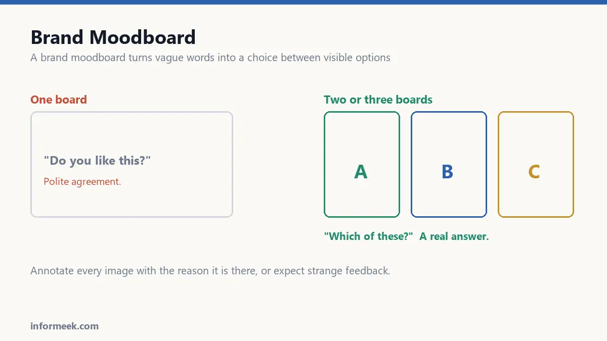
A single board invites polite agreement. People nod at it because disagreeing feels like criticism.
Two or three clearly different directions change the question from “do you like this?” to “which of these?”. That is far easier to answer honestly, and the answer is much more useful.
Make them genuinely different. Two boards that are variations of one idea teach you nothing.
What goes on it
- Colour, as large blocks rather than buried inside a photograph.
- Typography, shown as real words rather than font names.
- Photography style: lighting, crop, subject, treatment.
- Texture and material, especially if anything will be physical.
- Layout feel: dense or spacious, ordered or loose.
- A few things from outside your industry, which is where anything distinctive comes from.
What does not belong: competitors’ logos. Put those on a separate page. Mixing them in invites imitation, and the point is to look unlike them.
Annotate everything
This is the difference between a moodboard and a collage, and almost everyone skips it.
Beside each image, write the specific reason it is there. Not “nice” but “the way the type sits low on the page”, or “this exact green, not the rest of the photograph”.
Without notes, a client sees a photograph of a chair and concludes you want to sell chairs. With notes, they see you meant the muted palette and the honest materials. Unannotated boards generate the strangest feedback you will ever receive.
Keep it small
Fifteen to twenty images per direction is plenty. A board of eighty is a mood rather than a direction, and cannot be acted on.
Editing is the work. Anything that does not clearly belong is diluting whatever does.
The copyright bit
Images gathered for a private, internal board are generally fine as reference. Publishing that board, circulating it in a pitch deck, or letting any of those images reach finished work is a different matter entirely.
Keep a note of where each image came from. It costs nothing while collecting and is impossible to reconstruct later, and you will eventually need it.
Never let a reference image drift into the final design. It happens by accident more often than anyone admits, and it is a genuine legal exposure.
Turning it into decisions
A board that produces no written conclusions was a pleasant afternoon and nothing else.
Finish by writing down what was agreed, in plain sentences. Which direction won. Which specific elements to carry over from the others. What was rejected, and why.
That last part matters most. Recording rejections stops the same idea returning in week six as a fresh suggestion.
Running the session
Present the boards without saying which you prefer. Stated preference from the person who made them shapes every response that follows.
Ask people to point at specific elements rather than judge whole boards. “Which three things here feel right?” produces far better information than “what do you think?”.
Watch for the gap between what people say and what they point at. The stated preference is often the safe one; the pointing is honest.
Finish by writing down the conclusions in plain sentences, including what was rejected and why. That last part stops the same idea returning in week six as a fresh suggestion.
Mistakes that waste the exercise
- Making only one board. It invites polite agreement rather than a decision.
- Boards that are variations of one idea. They teach nothing, because there is no real choice.
- No annotation. A client sees a photograph of a chair and concludes you want to sell chairs.
- Including competitor logos. It invites imitation when the point is to look unlike them.
- Eighty images. That is a mood, not a direction, and it cannot be acted on.
Common questions
Is a moodboard the same as a mood film? No. A short film or animated board can convey pace and motion, which matters for anything with video or interface. For colour, type and texture, a still board is easier to compare.
Can I use images I found online? For private, internal reference, generally yes. Publishing the board, circulating it in a pitch, or letting any of those images reach finished work is a different matter entirely. Record the source of everything as you collect it.
How many people should be in the session? Few. Three or four decision makers. Large groups produce consensus, and consensus produces the least objectionable direction rather than the most distinctive one.
What if they like elements from different boards? Common, and usually fine. Note precisely which elements, then build one direction that carries them. What does not work is averaging two boards into a compromise.
Related reading
Continue with Brand Identity Elements, Brand Illustration Styles, Color Psychology in Branding. For the underlying standard, see UK guidance on copyright ownership.
Join the discussion