

Table of Contents
Table of contents
Most brand guidelines are a hundred-page PDF nobody opens. A useful brand guidelines document is short, specific, and answers the questions people ask when about to make something.
What it is for
A guidelines document exists so someone who has never met you can produce work that looks like yours.
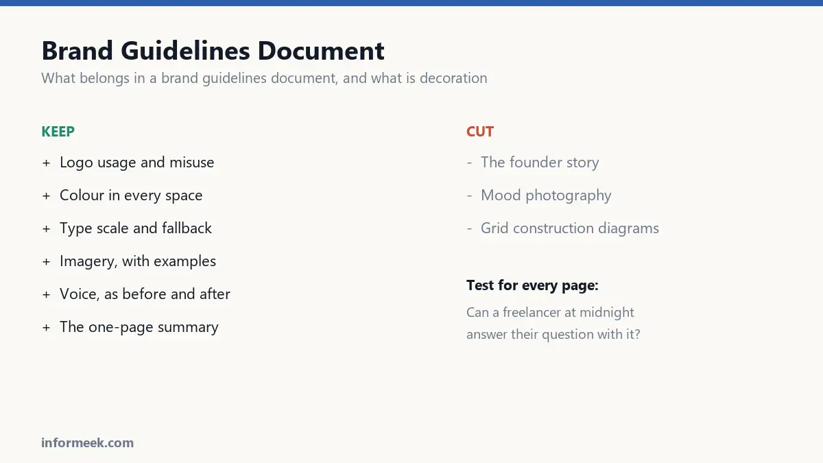
That is the test for every page in it. If a freelancer at midnight cannot use it to answer their question, the page is decoration.
It is also insurance. An identity that lives only in one designer’s judgement disappears when they do.
Brand guidelines document and the parts that earn their place
Logo usage. Every approved version, the minimum size, the clear space around it, and which backgrounds it may sit on. Include the file names so people can find them.
Logo misuse. The most-read page in any guidelines document. Show it stretched, recoloured, rotated, on a busy photo, with a drop shadow. People understand rules faster from what is forbidden than from what is permitted.
Colour. Not just the palette, but the exact values in every space you will need: HEX for screen, RGB, CMYK for print, and Pantone if you use spot colour. Add the proportions, because a palette without ratios gets used in equal amounts.
Typography. The typefaces, the weights you actually use, the size and spacing scale, and crucially a fallback for when the licensed font is unavailable. Somebody will build a slide deck on a laptop without your fonts installed.
Imagery. What photography or illustration should look like, with examples of both good and wrong. This section is usually vague and therefore ignored. Be specific: lighting, crop, subject, treatment.
Voice. How the brand writes. Best expressed as before and after pairs rather than adjectives, because “friendly but professional” means nothing and a rewritten sentence means everything.
What to leave out
The brand story, the founder’s journey, the mood photography of a mountain range. These are lovely and belong in a pitch deck.
Every page of that material pushes the practical answers further from the front, and the practical answers are the reason anyone opened the file.
The geometric construction diagram showing your logo built on a grid of circles is another one. It looks impressive and nobody has ever needed it.
Make it findable
A PDF emailed once will be the wrong version within a year. Somebody will always be working from an old copy.
Host it at a permanent address instead, with the asset files downloadable from the same place. One link, always current, that you can send to anyone.
Put the version number and date on it. When someone produces something wrong, you need to know which rules they were following.
Length
For most organisations, ten to twenty pages is right. A large company with many teams and product lines legitimately needs more.
If yours is running long, the usual cause is explaining reasoning rather than stating rules. People following guidelines do not need to be persuaded, they need to be told.
The one-page version
Whatever else you produce, make a single page holding the logo, the colour values, the typefaces, and the three most important rules.
This is the page that actually gets used, because it can be glanced at rather than read. Most questions are answered by it, and the full document exists for the rest.
If you only ever make one artefact, make this one.
The one page that gets used
If you produce nothing else, produce this. It answers most questions and can be glanced at rather than read.
The logo, shown in its primary and single-colour forms. The colour values in every space you need: hex, RGB, CMYK, and a spot colour if you use one. The typefaces with their weights, and the fallback for machines without them installed. The minimum size and the clear space. And three rules that matter more than the rest.
Put a version number and a date on it. When someone produces something wrong, you need to know which version they were following.
Mistakes that make guidelines useless
- Leading with the brand story. It pushes the practical answers further from the front, and practical answers are why the file was opened.
- Explaining reasoning instead of stating rules. Someone following guidelines needs to be told, not persuaded.
- Emailing a PDF once. Within a year several people are working from an outdated copy.
- Omitting the misuse page. The most-read page in any guideline document, because people learn rules fastest from what is forbidden.
- No fallback font. Somebody will build a deck on a machine without your licensed typeface.
Common questions
How long should guidelines be? Ten to twenty pages for most organisations. A large company with many teams and product lines legitimately needs more. If yours is running long, check whether it is explaining rather than instructing.
PDF or a web page? A web page at a permanent address, with the asset files downloadable from the same place. One link that is always current beats a file that forks the moment it is sent.
Who should own it? Someone specific, by name. Guidelines owned by a department drift, because no individual is responsible for keeping them true.
What about tone of voice? Express it as before and after pairs rather than adjectives. “Friendly but professional” means nothing to a writer. A rewritten sentence means everything.
Related reading
Continue with Brand Identity Elements, Brand Font Pairing, Luxury Color Palette. For the underlying standard, see Google Fonts Knowledge on type systems.

Join the discussion