

Table of Contents
Table of contents
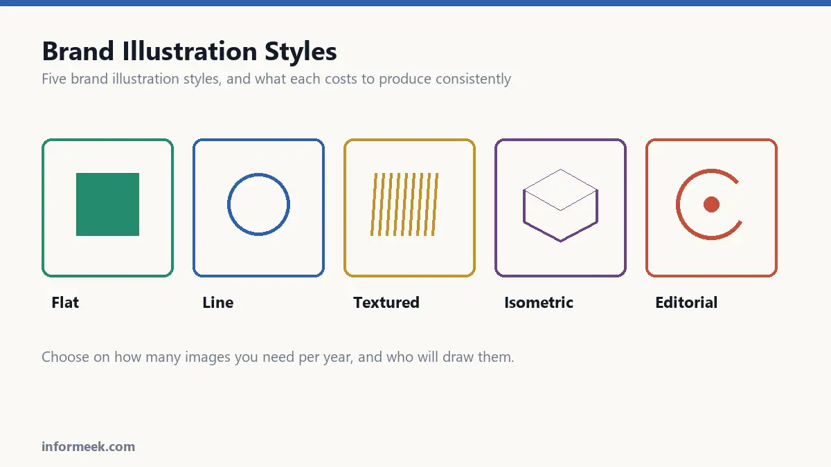
Illustration is the part of an identity competitors find hardest to copy. A logo can be imitated in an afternoon; brand illustration styles take real commitment.
Why bother at all
Stock photography is available to everyone, including your competitors. The same smiling team around the same laptop appears on hundreds of sites.
Illustration is owned. Once you have a style, every new picture reinforces the last one, and after a year the look itself becomes recognisable without a logo attached.
It also solves problems photography cannot. Abstract ideas, processes, things that do not exist yet, and anything you would otherwise need a photoshoot and a location for.
Brand illustration styles and the main styles
Flat and geometric. Simple shapes, limited palette, no gradients or shadows. Scales well, loads fast, easy for several illustrators to produce consistently. The drawback is ubiquity: this look dominated the last decade and is now the default, which makes it safe and unremarkable.
Line work. Outlines with little or no fill. Elegant, cheap to produce, and reproduces beautifully in one colour, which makes it practical for print and embroidery. Can feel cold if the whole identity leans on it.
Textured and hand drawn. Visible brush marks, grain, imperfection. Reads as human and crafted, and suits food, wellness and anything artisanal. Harder to keep consistent, and the texture can disappear at small sizes or on cheap paper.
Isometric. Three-dimensional scenes drawn at a fixed angle with no perspective distortion. Excellent for showing systems, processes and how parts connect. Overused in software, and expensive per image.
Editorial and conceptual. Closer to what appears alongside a magazine article. Carries genuine personality, communicates abstract ideas well, and needs a skilled illustrator rather than a template.
Choosing between them
Three questions settle it faster than any moodboard.
How many images will you need per year? If the answer is two hundred, you need a style someone can produce quickly and repeatably. If it is six, you can afford something elaborate.
Who will make them? A style depending on one illustrator’s hand becomes a liability when they are unavailable. A system of shapes and rules can be handed to anyone.
Where will they appear? Something that works on a website may collapse when printed small, embroidered, or shown on a dark background.
Consistency comes from rules, not taste
This is the part that separates a real style from a collection of nice drawings.
Write down the specifics: the exact palette, the line weight, whether corners are rounded or sharp, whether figures have faces, the perspective, whether shadows exist, how much detail is allowed.
Those rules are what let a second illustrator produce work that matches the first. Without them you get fifteen images that were each fine on their own and do not belong together.
Practical points
- Build a library, not one-offs. Reusable components mean the tenth illustration costs far less than the first.
- Keep everything as vector where the style allows, so one file serves every size.
- Get the source files in your contract, not just exported images. Without them you cannot edit anything later.
- Agree the licence. Commissioning artwork does not automatically transfer copyright in most jurisdictions. If you need to own it, that has to be written down.
- Check it in one colour before committing to the style.
On generated illustration
AI image tools make it cheap to produce something that looks like an illustration style. They are much worse at producing the same style twice, which is the entire point of a brand style.
There are also unsettled questions about the copyright status of generated images in several jurisdictions, which matters if the artwork will appear on packaging or in advertising.
Useful for exploring directions quickly. Risky as the finished asset for anything you need to own outright.
What consistency actually requires
A style is a set of written constraints, not a feeling. Write these down and a second illustrator can match the first.
The exact palette, with hex values. The line weight, as a number. Whether corners are sharp or rounded, and at what radius. Whether figures have faces. The perspective. Whether shadows exist and how they behave. How much detail is permitted before an image is too busy.
Without those, you get fifteen images that were each fine alone and clearly do not belong together.
Mistakes that get expensive
- Not getting source files. Exported images cannot be edited, recoloured or adapted later.
- Assuming you own the copyright. Commissioning work does not transfer it automatically in many jurisdictions. It must be assigned in writing.
- Choosing a style only one person can draw. It becomes a bottleneck and then a liability.
- Not testing at small sizes. Fine texture disappears entirely on a business card or a favicon.
- Building one-offs instead of a library. Reusable components make the tenth illustration far cheaper than the first.
Common questions
Illustration or photography? Photography is better for showing real products and real people. Illustration is better for abstract ideas, processes, and anything that does not exist yet. Illustration is also owned, which stock photography is not.
How much does a brand illustration style cost? Highly variable, but budget for the system rather than the images. Paying once for a documented style and a component library is what makes every subsequent image affordable.
Can AI generate our illustration style? It can produce something that looks like a style. It is much weaker at producing the same style twice, which is the entire point. There are also unsettled copyright questions in several jurisdictions, which matters for packaging and advertising.
Should illustrations be vector? Where the style allows, yes, so one file serves every size. Textured and painterly styles are necessarily raster, which means exporting at the largest size you will ever need.
Related reading
Continue with Brand Identity Elements, Icon Design, Brand Moodboard. For the underlying standard, see UK guidance on copyright ownership.
Join the discussion