

Table of Contents
Table of contents
Someone asks for your logo. You send the file you have. They come back asking for a different one. That happens because logo file formats are a set, not a single file.
What you should actually own
A properly delivered logo package contains a handful of variants. If a designer gave you one PNG and nothing else, you did not get a logo package.
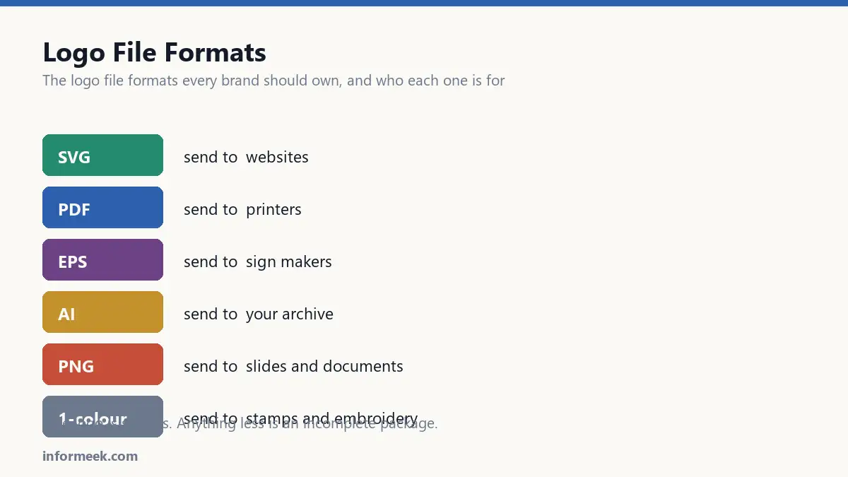
- Master vector file (AI or EPS), fully editable, with live text. This is the original everything else comes from.
- PDF with fonts outlined, for sending to printers.
- SVG for websites.
- PNG with transparent background, in a few sizes, for slides and documents.
- A single-colour version, usually solid black, for stamps, embroidery and anywhere colour is unavailable.
- A reversed version in white, for dark backgrounds.
If you are commissioning a logo, ask for that list explicitly before work starts. Getting it later means paying twice.
Logo file formats and which file to send
- Printer: PDF with outlined fonts, or EPS if they ask by name.
- Web developer: SVG.
- Colleague building a slide: PNG with transparency. They cannot open a vector and do not need one.
- Sign maker or embroiderer: EPS or AI. Ask first; these trades are particular.
- A journalist or partner: PNG for convenience and a PDF alongside it, so they have the good one if they need it.
PNG or JPEG
For a logo, always PNG. Never JPEG.
JPEG cannot store transparency, so your logo arrives in a white box that shows up against any coloured background. JPEG also compresses by discarding detail, and the artefacts it creates cluster around exactly the hard edges a logo is made of.
PNG keeps edges crisp and supports a transparent background. It is larger, and for a logo that does not matter.
Why outlining fonts matters
A vector file with live text needs the font installed to display correctly. Your printer does not have your font. Their software substitutes something else, and your wordmark arrives in the wrong typeface with the spacing wrecked.
Converting text to outlines turns the letterforms into plain shapes that need no font. Do this on the copy you send out.
Never do it on your master. Outlined text cannot be edited, so if you outline the original you can never fix a typo or adjust the spacing again.
Naming, which sounds trivial and is not
A folder containing logo.png, logo2.png, logo-final.png and logo-FINAL-v3-USE-THIS.png guarantees the wrong one gets used.
acme-logo-full-colour.svg
acme-logo-full-colour.pdf
acme-logo-black.pdf
acme-logo-white.pdf
acme-logo-full-colour-1000px.png
acme-logo-white-1000px.png
Name by what it is, not by when you made it. Anyone can then pick correctly without asking.
Clear space and minimum size
Two rules worth writing down and sending with the files.
Clear space is the empty margin that must surround the logo. A common convention is the height of one letter from the wordmark. It stops people crowding it against other elements.
Minimum size is the smallest it may be reproduced before detail collapses. Test it by printing at that size, not by zooming out on screen.
Without these, someone will eventually put your logo at 8mm wide next to a heading, and it will look broken rather than small.
If you only have a JPEG
Very common with older brands where the original is long lost.
It has to be redrawn as a vector. Auto-tracing gets close on simple shapes and leaves wobbly curves that show at large sizes. Paying someone to rebuild it once is cheaper than living with a slightly wrong logo for a decade.
What a complete handover looks like
Ask for this list in writing before a designer starts, not after they invoice.
The editable master with live text. A PDF with fonts outlined. An SVG. PNGs with transparency at two or three sizes. A solid single-colour version. A reversed white version. And a short note recording the minimum size and the clear space.
That is perhaps twenty minutes of exporting for someone who already has the artwork open. Requested six months later it becomes a paid job, assuming they still have the file.
Mistakes that cause the most emails
- Sending a JPEG to a printer. No transparency, compression artefacts around every edge, and no way to scale.
- Sending a working file to a non-designer. They cannot open it and will screenshot the preview.
- Only having a version with a white background. It will appear as a white box on every coloured header.
- No single-colour version. The first embroidery or stamp order stalls immediately.
- Version names like final-v3-USE-THIS. Guarantees the wrong file gets used eventually.
Common questions
What size PNG should I export? At least 1000 pixels on the long edge for general use, and a small one around 250 pixels for email signatures. Exporting at exactly the display size leaves nothing for high-density screens.
Do I need a favicon version? Yes, and it usually needs redrawing rather than shrinking. At 16 pixels most logos lose their detail entirely, so the favicon is often a single letter or the simplest element of the mark.
What is clear space and why does it matter? The empty margin that must surround the logo, commonly the height of one letter from the wordmark. Without it stated, someone will eventually crowd the logo against a heading and it will look cramped rather than deliberate.
Can I recolour the logo for a campaign? Decide once and write it down. Allowing it produces drift; forbidding it produces awkward exceptions. Most brands permit the approved single-colour version in any brand colour, and nothing else.
Related reading
Continue with Brand Identity Elements, Vector File Formats, Logo Design Principles. For the underlying standard, see the W3C SVG specification.

Join the discussion