

Table of Contents
Table of contents
You approve a design on screen. It arrives from the printer looking flat and slightly wrong. The difference between CMYK vs RGB is why, and nobody made a mistake.
Nobody made a mistake. Screens and paper make colour in completely opposite ways, and some colours exist in one and simply do not exist in the other.
One adds light, one takes it away
A screen starts black and emits light. Red, green and blue light are added together, and the more you add, the brighter it gets. All three at full strength gives white. This is called additive colour, and it is what RGB means.
Paper starts white and reflects light. Ink absorbs some of it, and whatever bounces back is the colour you see. The more ink, the less light comes back. This is subtractive, and it is what CMYK means: cyan, magenta, yellow and key, which is black.
So a screen makes colour by adding light and paper makes colour by removing it. That single difference explains everything else.
Cmyk vs rgb and why K is black
In theory, cyan, magenta and yellow together should give black. In practice they give a muddy brown, because real ink is not perfect.
So a fourth, genuinely black ink is added. It is called key because the other plates are aligned to it during printing. It also saves a great deal of ink, since most printed matter is mostly black text.
The part that actually causes the problem
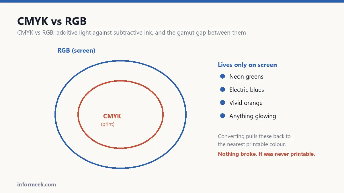
The range of colours a system can produce is called its gamut, and the two gamuts are different shapes.
RGB can make bright, saturated colours that CMYK physically cannot. Vivid oranges, electric blues, neon greens and anything glowing simply have no ink equivalent.
When you convert, those colours get pulled back to the nearest printable one. That is why the change looks like the life has been taken out of the design. Nothing broke. The colour was never printable in the first place.
Which to use
- RGB for anything that stays on a screen. Websites, apps, social posts, email, video, presentations.
- CMYK for anything printed with ink. Flyers, packaging, magazines, business cards, banners.
The rule that saves the most grief: work in the colour space of the final output from the very start. If it is going to print, set the document to CMYK before you design, not after.
Designing in RGB and converting at the end is how you fall in love with a colour that cannot be printed.
Where Pantone fits
Pantone is a third thing, and it solves a different problem.
CMYK builds a colour from four inks mixed on the page, so it shifts slightly between printers, papers and days. A spot colour is pre-mixed ink of one exact shade, so it comes out identical everywhere.
That is why brands with a signature colour specify one. It also reaches colours outside CMYK entirely, including metallics and fluorescents. The cost is another plate on the press, so it is used for logos and packaging rather than general artwork.
Practical rules
- Never trust your monitor for print colour. It is emitting light at a brightness paper cannot match. Use a printed swatch book.
- Do not use rich black for small text. Body copy should be 100% K only. Mixing four inks under 9pt type produces fuzzy edges when the plates shift a hair.
- Use rich black for large solid areas, or they look washed out. Ask your printer for their preferred mix.
- Ask which profile they want. Coated and uncoated stock absorb ink differently and need different settings.
- Watch total ink coverage. All four at 100% is 400%, which will not dry. Most presses cap around 300%.
The one habit worth adopting
Before signing off anything expensive, ask the printer for a proof on the actual stock.
It costs a little and takes a few days. It is also the only way to see what you are genuinely buying, and it is considerably cheaper than discovering the problem across five thousand copies.
A worked example
A brand picks a bright teal on screen. In RGB it is vivid and slightly luminous, and everyone approves it.
Converted to CMYK, it lands as a duller blue-green. Nothing was done incorrectly. That particular teal sits outside what four inks on paper can produce, so it was pulled to the nearest achievable colour.
There are three honest responses. Accept the printed version and design around it. Choose a different teal that sits inside the printable range from the start. Or specify a spot colour, which reaches outside CMYK at the cost of an extra plate.
What does not work is repeatedly asking the printer to make it brighter. The limit is physical.
Mistakes that cause reprints
- Designing in RGB and converting at the end. You fall in love with colours that were never printable.
- Using rich black for small text. Four inks under 9pt type produce fuzzy edges when the plates shift fractionally. Body copy should be 100% K only.
- Using flat 100% K for large solid areas. It looks washed out and grey. Large blacks need a rich mix, and your printer will tell you theirs.
- Exceeding total ink limits. All four inks at 100% is 400% coverage, which will not dry. Most presses cap around 300%.
- Trusting a monitor. A screen emits light at a brightness paper cannot reflect. Use a printed swatch book.
Common questions
Can I just convert at the end? You can, and you will be disappointed by any saturated colour. Set the document to CMYK before designing so you only ever see printable colours.
Why does my black look different on two pages? Almost always one is 100% K and the other is a rich black mix. Check both, and standardise.
What is a colour profile and do I need one? A profile describes how a specific device reproduces colour. Your printer will name the one they want, commonly a coated or uncoated European or US standard. Using theirs rather than your default removes a whole class of surprise.
Is Pantone worth the cost? For a logo that must be identical everywhere, usually yes. For general artwork, rarely, since it adds a plate to every print run.
Related reading
Continue with Brand Identity Elements, Print Resolution, Bleed and Trim. For the underlying standard, see the ICC specification for sRGB.



Join the discussion