

Packaging design is the only part of a brand a customer physically holds, and it is judged in about the time it takes to walk past a shelf or open a delivery box. That is a design brief with unusually hard constraints: a legibility minimum set by law, an environmental claim that can be challenged by a regulator, a barcode that has to scan first time, and a structure that has to survive a lorry. The rules below are the ones with published sources behind them.
Updated October 2026. General information, not legal advice. Labelling, claims and packaging rules differ by market; confirm requirements for every country you sell into.
Legibility is a legal minimum before it is a design choice
In the European Union and the UK, food labelling is not left to taste. Article 13 of Regulation 1169/2011 requires mandatory particulars to be marked in a conspicuous place, easily visible and clearly legible, and sets a minimum x-height of 1.2 mm for the type used. Packages with a surface area under 80 square centimetres get a reduced minimum of 0.9 mm. The regulation also requires the name of the food, the ingredients list and the net quantity to appear in the same field of vision.
Designers who have not met this rule tend to discover it at artwork sign-off, when a layout built around a large image has to be rebuilt around text. Start from the legal block and design outwards. The same discipline helps commercially: if the mandatory text is comfortably legible, the brand elements above it almost always read at distance too. Our notes on print resolution and on bleed and trim cover the production side of getting that artwork through a press unchanged.
Environmental claims are a regulated statement, not a mood
A recycling symbol is a claim, and in the United States it is measured. The FTC’s Green Guides, codified at 16 CFR 260.12, allow an unqualified recyclable claim only where the entire product or package, excluding minor incidental components, is recyclable, and where collection is available to a substantial majority of consumers or communities where the item is sold. The rule defines that substantial majority as at least 60 percent. Below that, the claim has to be qualified, with stronger qualification as availability falls.
The European Union has gone further and made recyclability a product requirement rather than a marketing one. Regulation (EU) 2025/40 on packaging and packaging waste has been in force since 11 February 2025 and applies from 12 August 2026. The Commission describes its aim as making all packaging on the EU market recyclable in an economically viable way by 2030, increasing the use of recycled plastics, and reducing virgin material use. For scale, the Commission cites 186.5 kg of packaging waste generated per person in the EU in 2022.
The design consequence is material selection, not graphics. A metallised film laminate, a dark carbon-black tray or a shrink sleeve covering most of a bottle can each defeat the sorting infrastructure that the claim depends on. If the pack is meant to carry a recyclability message, the structure has to earn it first.
6 simple rules for packaging design that sells
- Design the legal block first. In the EU and UK, mandatory food particulars need a 1.2 mm x-height, or 0.9 mm on packs under 80 square centimetres, with name, ingredients and net quantity in one field of vision.
- Test at a distance and at thumbnail size. A pack competes from a metre away on a shelf and at a few hundred pixels in an online listing. If it fails either test, it fails.
- Make the silhouette do the identifying. Structure is recognised faster than graphics, is harder for a competitor to copy, and decides how many units fit on a pallet.
- Qualify every environmental claim. Under 16 CFR 260.12 an unqualified recyclable claim needs collection available to at least 60 percent of consumers or communities where the item is sold.
- Protect the barcode and the scan. Leave the quiet zone clear, keep the symbol on a flat area, and avoid placing it across a seam, a curve or a varnish that confuses a reader.
- Prove the pack in transit before launch. ISTA publishes general simulation procedures designed to “provide a simulation of the damage-producing motions, forces, conditions, and sequences of transport environments”, which is a better test than optimism.
The e-commerce box is now a second design problem
A pack designed for a shelf and a pack designed for a courier are not the same object. On a shelf the enemy is anonymity; in a parcel the enemy is damage and wasted volume. Packs that ship without an outer carton need to survive handling on their own, and the first impression moves from the shelf to the moment of opening.
This is also where sustainability and cost pull in the same direction. Smaller void volume means lower shipping cost, fewer damages and less filler to dispose of, which is why transit testing pays for itself. The honest framing is that packaging design for e-commerce is a logistics discipline wearing a brand costume, and that the brand work has to fit inside the logistics constraints rather than the other way round.
What actually moves a purchase
- Recognition at speed. Colour block, silhouette and one dominant element, read at a glance rather than studied.
- One clear reason to pick it up. Packs that try to say five things say none. Decide the single claim and let the rest be findable, not prominent.
- Legible mandatory information. Beyond the legal requirement, readable ingredients and quantities reduce the hesitation that loses a sale.
- A structure that behaves. Opens without tearing, recloses if it should, stands up on a shelf and in a cupboard.
- Consistency with the rest of the identity. A pack that contradicts the brand elsewhere spends its recognition budget twice; our notes on brand identity elements and on CMYK versus RGB cover keeping colour and tone aligned across print and screen.
None of this requires a bigger budget. It requires the order of work to change: constraints first, claims checked against the actual rule, structure proven in transit, and graphics last. Packaging design done in that sequence tends to reach launch without the expensive late rebuild that most projects treat as inevitable.
Common questions
How small can type on a food pack be? In the EU and UK, Article 13 of Regulation 1169/2011 sets a minimum x-height of 1.2 mm for mandatory particulars, reduced to 0.9 mm where the largest surface area is under 80 square centimetres.
When can I call a pack recyclable? Under the FTC Green Guides at 16 CFR 260.12, an unqualified claim requires the whole pack, minus minor incidental components, to be recyclable and collection to be available to a substantial majority, defined as at least 60 percent, of consumers or communities where it is sold.
What changes under the EU packaging regulation? Regulation (EU) 2025/40 has been in force since 11 February 2025 and applies from 12 August 2026. The Commission’s stated aim includes making all packaging on the EU market recyclable in an economically viable way by 2030 and increasing recycled plastic content.
Does structure matter more than graphics? For recognition at speed, usually yes. A distinctive silhouette is recognised faster, is harder to imitate, and also determines pallet efficiency and shipping cost in a way that artwork never does.
How do I know the pack will survive shipping? Test it. ISTA publishes procedures from simple screening tests to general simulation sequences intended to reproduce the motions, forces and conditions of real transport environments, plus member-specific procedures used by large retailers and carriers.
Sources and further reading
Where the figures and rules above come from, so you can check them:
- Unqualified recyclable claims and the 60 percent substantial majority threshold: 16 CFR 260.12, Cornell Legal Information Institute
- Regulation (EU) 2025/40, dates of force and application, recyclability by 2030 and packaging waste per person: European Commission, packaging waste
- Article 13, presentation of mandatory particulars and the 1.2 mm and 0.9 mm x-height minimums: Regulation (EU) No 1169/2011, legislation.gov.uk
- Transit testing series and the definition of general simulation procedures: International Safe Transit Association
- Green Guides scope and the FTC’s review of recyclable claims: US Federal Trade Commission
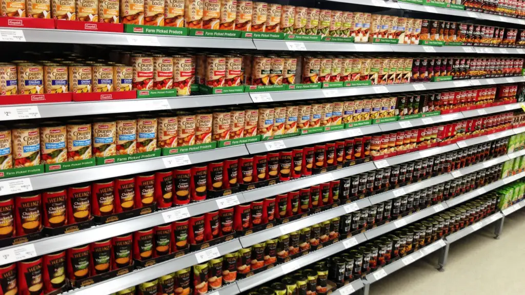
Photo credit: Faced products on a supermarket shelf by Amnesiac86, CC BY-SA 3.0, via Wikimedia Commons.

Join the discussion